Creating a Diverse and Inclusive Online Experience at Zest
/Last week Zest released the Refresh Lincoln Audio Experience as an additional point of access to the installation of the same name, currently visible in Lincoln city centre through 4 September. When landing on Zest’s website, those looking to engage with Refresh Lincoln via headphones, will also notice new accessibility tools, provided by Recite Me, in order to support the diverse range of people in our community.
1 in 5 people in the UK has a disability that can prevent website users from reading and understanding online content. Those who are most susceptible to access barriers are those who struggle with:
Decreased vision
Learning difficulties
Literacy
Language/linguistic problems
Attention disorders
Physical disabilities
Recite Me is an assistive technology that provides support for all of these, making our website inclusive and a place where people can easily access information about Zest and what we’re up to.
Recite Me is now available to use on our website, and provides users the opportunity to customise their experience in a way that suits their individual access needs. The toolbar includes screen reading functionality, multiple reading aids, a dictionary and thesaurus, an on-demand live translation feature with over 100 languages including 35 texts to speech, and styling options that include changes to the font size, type, and colour. You can learn more about each setting through their handy user guide.
To access the assistive toolbar on our website, just click “Accessibility Tools” in the main menu or give it a go now by clicking the button below!
While this is a big investment for a small company like Zest, we are committed to keeping our work as accessible as possible, and Recite Me builds on Zest’s previous commitment to accessibility in our work over the years.
Zest’s commitment to access on Refresh Lincoln
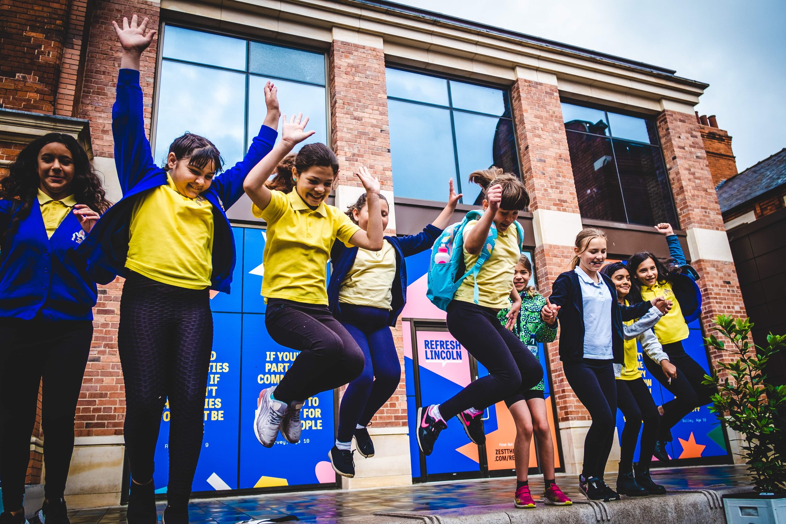
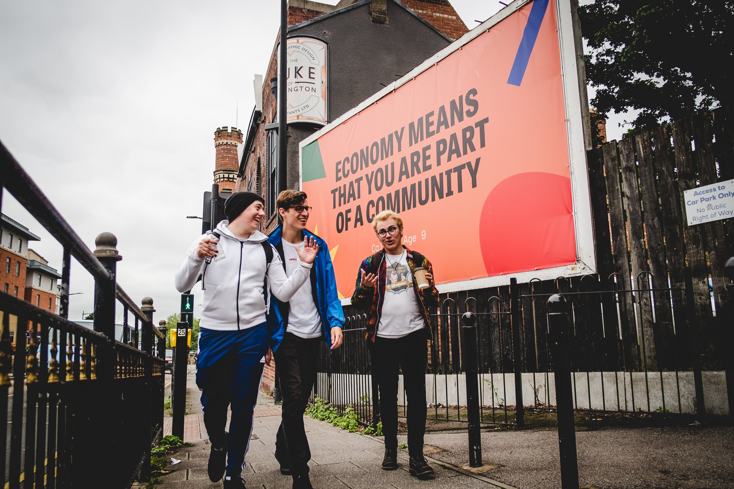
The Refresh branding guide, used to design Refresh Lincoln, went through a consultancy process with Zest’s youth advisory board Future Proof. They were shown three potential sets of artwork, and fed back on ones that were less accessible due to dyslexia, neurodivergence, and even conditions like epilepsy. They fed back on elements like legibility, preferring text with clean straight lines on solid backgrounds, noting that too many patterns can be distracting, and some colour combinations that create motion, which could be triggering. The clean design you now see on Refresh Lincoln was Future Proof approved, after feeding back the specific needs and requests of our intersectional group to the graphic designer.
Zest was also given the opportunity through Here and Now and Lincolnshire Community Foundation via Lincoln BIG to create the Refresh Lincoln Audio Experience. Equal parts creating access to and a legacy for the installation, this additional commission meant that Zest could really think about what it means to deliver work accessibly and equitably, and specifically in ways that are as engaging and meaningful as the installation itself. We believe (and hope!) that our collaboration with composer Tom Rackham has accomplished this, capturing sound from each iconic Lincoln location with a bespoke score to underpin the voices of our city’s children and young people – allowing that experience to extend to those who are blind or visually impaired, homebound or isolating, neurodiverse, or even those with a connection to Lincoln who are based elsewhere.
The addition of Recite Me to our website was a bonus for this project, funded ahead of the release of a yet-to-be-announced project (stay tuned!), but one we felt was important to implement early as part of the release of the Refresh Lincoln Audio Experience.
Top Tips and Quick Wins
Now, it’s all well and good when you have a decent amount of funding to back creative choices like the Audio Experience or to implement what can feel like expensive software. However, there are things any small company (like Zest!) can do cheaply or for free.
Hashtag etiquette
Capitalising each new word in a hashtag helps readers, organic or automated, differentiate the words. It’s friendlier for screen readers to read aloud, and it’s easier to read for those who might struggle to read for any number of reasons, such as those who are dyslexic or neurodiverse.
Alt text on social media and websites
Alternative text, or alt text, is a short, written description of an image that can be read by assistive technologies (like screen readers) and can provide an audio description of images. This is particularly useful for the production photography for Refresh Lincoln which features words in images that won’t be captured as text. It’s creating additional access, but Toby (AD of Zest) also finds it a fun creative exercise to better understand the work and our marketing imagery. Each social media and website platform will have varying ways to enter alt text – some will generate it automatically - but as it has become more mainstream, you no longer need to be a coder to add this to your images.
We encourage you to explore and find out more! Facebook, Instagram, Twitter, and Squarespace (our website platform) all keep it pretty straightforward, but if you aren’t confident with alt text, add an image description in your post or in a comment until you are.
Captioning
As Zest adapted to the digital landscape of the pandemic, we began using captioning services for our digital work, but also as a Zoom integration for our professional meetings, webinars, and weekly Future Proof meetings. Captions were an integral part of some of our young people engaging as the audio and video stimulation on Zoom can become overwhelming. If you’re already paying for a professional Zoom subscription, the Rev integration is a comparable monthly fee once converted from USD, and negligible in a production budget when it comes to captioning a specific piece. Lots of platforms like YouTube also have automatic captioning available, but using a service like Rev allows some creative control to make sure they’re correct and always appear with your video when you post it.


